Pairings for Target
Driving shopper engagement by 50% at Target.
I redesigned the PairAnything Pairing Recommender to help Target shoppers discover new wines that pair with their favorite dishes while shopping in-store. By designing the experience to prioritize user trust, I increased shopper engagement from 5% to 56% across 21 Target stores.
Role
Product Designer
Duration
3 months
Team
CEO, developers, data scientists

Problem
Users didn’t trust our recommendations in the old design.
The original web app was built for small wineries who uploaded their full inventory to PairAnything, and our algorithm would recommend two wines at a time from that list. However, Target, our first major retail customer, didn't want to upload their entire catalog. Instead, they wanted to feature just two promotional wines. This created a critical problem: those same two wines would appear for every search, no matter what dish a shopper entered.
Our credibility was at stake. If shoppers suspected we were just pushing the same products repeatedly, it would make Target look unknowledgeable as a wine brand and jeopardize our partnership. I needed to redesign the experience to deliver genuine, valuable recommendations to shoppers while still meeting Target's business constraints.
“
We don’t want to look unknowledgeable.
- Target Partner, on brand credibility concerns
Rationale
How might we...
Build trust with Target shoppers and help them buy wine they'll enjoy?
More concretely, I wanted to know:
- How many pairing recommendations do we show? Do we allow users to “refresh” or “Show More” pairings?
- Should we prioritize Promoted wines?
- Should we show wines of each type (white, red, etc.)?
4 recommendations built trust without overwhelming users
With the old design, I heard a common complaint from users that our recommendations felt like ads. I hypothesized that showing more than two recommendations would make the experience feel organic and give room to show more diverse wines. To test this, I prototyped three versions:
- 10 recommendations shown at once
- 4 recommendations with a "Show More" button
- 3 recommendations with a "Refresh" button to load new ones
“
Is this just an ad? It always shows Pinot Noir or Riesling!
- User testing the old product
I user tested the three prototypes and learned:
- Four was the sweet spot. 10 felt overwhelming; fewer than 4 felt limited.
- Users wanted to see all results immediately. Clicking "Show More" for just four total results felt like unnecessary friction.
- "Refresh" undermined credibility. It made recommendations feel random instead of personalized, which damaged trust.
Based on this research, I designed the final experience to show four recommendations upfront with no extra interactions. I also advocated to the CEO to recommend from Target's full wine catalog, not just promoted wines, so users would see genuine variety beyond "Pinot Noir and Riesling every time."
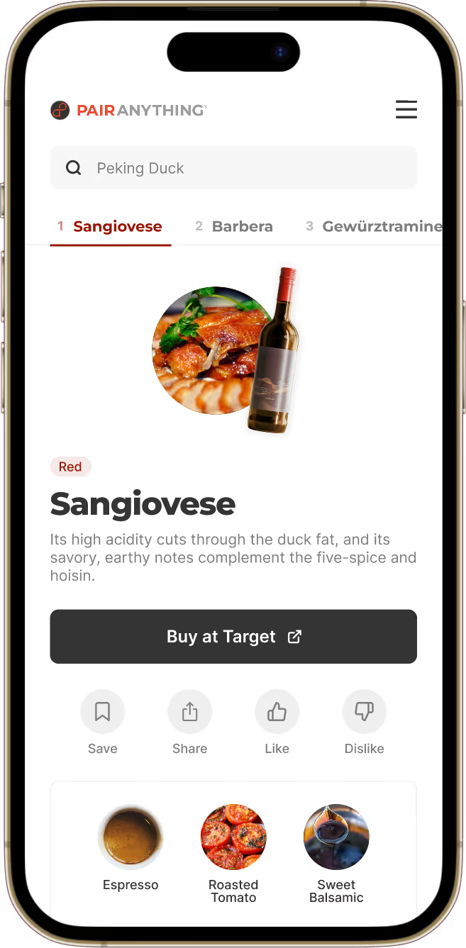
In the final design, users receive four wine pairing results.
Recommend all Target wines, not just promoted ones
In the old design, we only recommended two Promoted wines, which made users suspicious. This raised a critical question: Should we limit recommendations to Promoted wines, or open it up to Target's entire catalog?
My goal was to build trust with users while keeping the technical scope to a minimum for our solo developer. I proposed leveraging Target.com's existing search function to recommend all wines sold at Target, not just promoted ones.
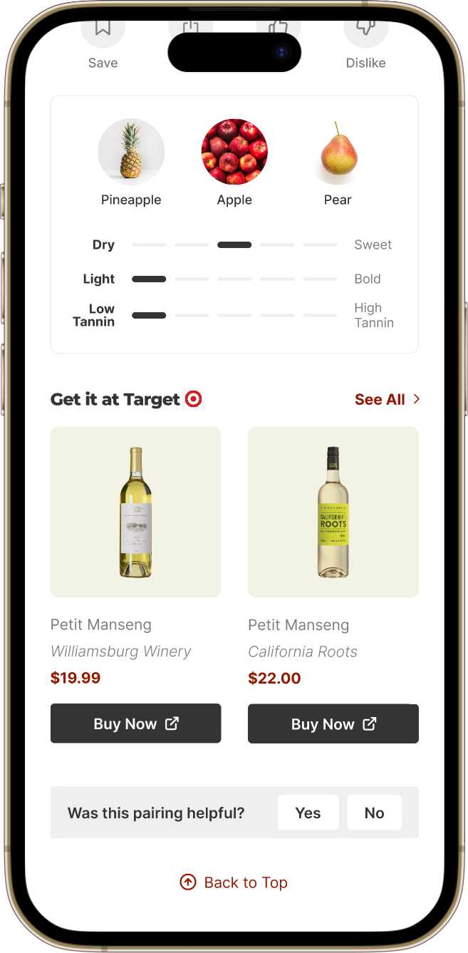
Promoted wines get direct links to their product pages on Target.com and are spotlighted under 'Get it at Target' with an in-app details page. Non-promoted wines link to Target.com search results for that wine.
This approach worked for everyone. Shoppers got genuine recommendations, Target got traffic to their full catalog, and we kept development simple:
- All wines sold at Target are now eligible for recommendations, giving users genuine variety
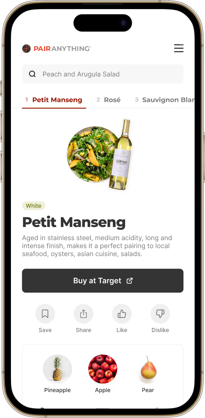
- Every recommendation includes a "Buy at Target" button linking to Target.com search results for that wine
- Promoted wines get special treatment: a highlighted "Get it at Target" section with direct product page links, plus a dedicated detail page within PairAnything
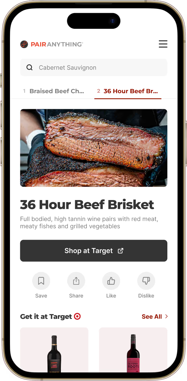
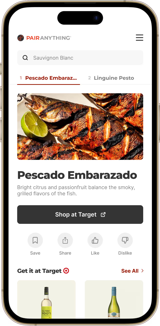
Food pairing results link to ingredient search results on Target.com, keeping shoppers in Target's ecosystem.
We applied the same pattern to wine-to-food searches. When shoppers search for a wine like "Cabernet Sauvignon" and get food pairings like "Beef Brisket," the "Shop at Target" button links to Target.com's search results for that dish's ingredients.
Recommend genuine pairings and allow for personalization
Target raised a concern about accommodating different preferences:
“
What if the shopper doesn’t like red wine? Can we show at least one red and one white wine recommendation each time?
- Target Partner
This led me to explore whether we should guarantee a mix of red and white wines in every result. To test this, I prototyped a version that always showed wines from different categories (red, white, rosé, sparkling) and had sommeliers and casual wine drinkers try it out.

“
I wouldn't trust you if you told me a white wine pairs better than a red for steak.
- Sommelier, after testing the prototype
“
I can’t tell if Champagne is better than Cabernet Sauvignon, or if it’s the best wine in the white category only.
- Casual wine drinker, after testing the prototype
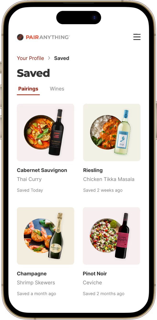
Both sommeliers and casual wine drinkers found the forced variety confusing and less trustworthy. Instead of forcing wine variety, I introduced Like/Dislike buttons so shoppers could personalize recommendations based on their preferences. This maintained pairing accuracy while addressing Target's concern and positioned them as a credible wine authority.
We recommend genuine pairings regardless of wine type, and allow users to dislike wines to personalize their experience.
Fixing the search experience
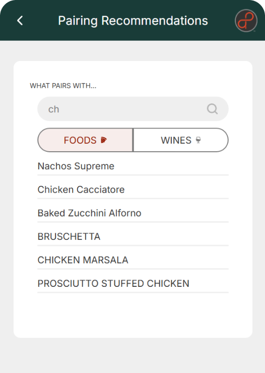
Beyond improving how recommendations were made, I addressed core usability issues identified from user interviews. In the old design, users had to tap 'Wine' or 'Food' first before typing their search. This caused failed searches, like searching 'Chardonnay' under 'Food'; leading users to exit without seeing any pairings.
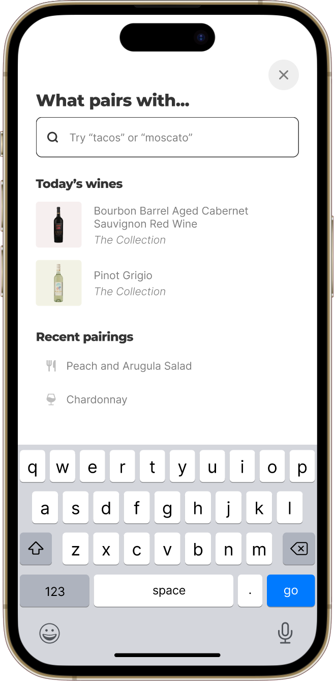
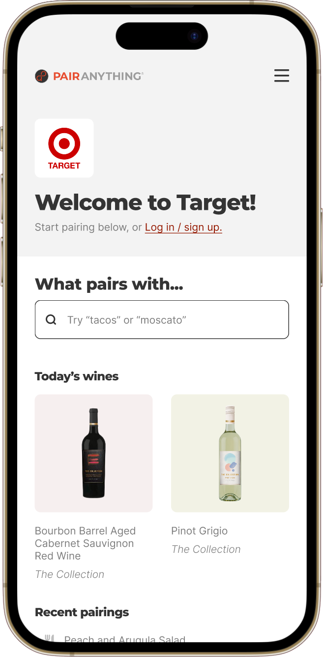
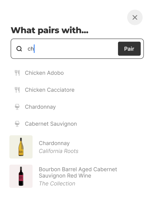
In the redesign, I combined food and wine searches into one search bar with autofill suggestions from both categories. Now, users can simply type their query, and receive the correct pairing. I also made the search bar sticky at the top on all pages, boosting engagement rate from 5% to 56%.
Before
Users must tap 'Wine' or 'Food' first before typing their search, causing many failed searches and high exit rate.
After
Users can type in any food or wine and receive the correct pairing, boosting engagement rate from 5% to 56%.
Visual context helped users trust our recommendations
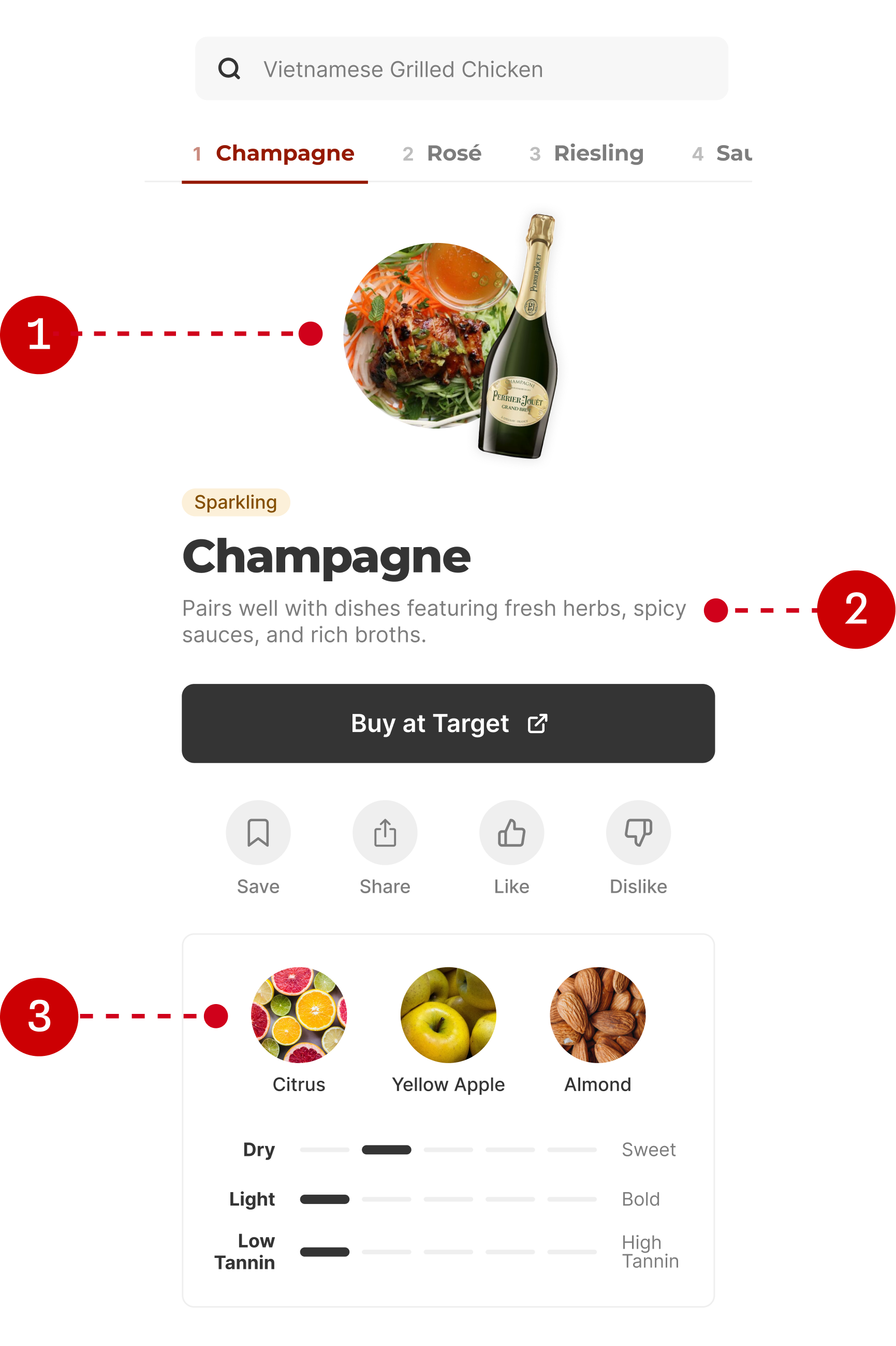
User testing the old design revealed users needed two things: confirmation we understood their search, and explanations for why wines paired with their dish. Without this context, they didn't trust our recommendations. To address this, I added visual context to each recommendation:
- Photos of the wine and food confirm we understood their search
- A brief pairing explanation describes why the wine and food pair
- Photos of key flavor notes show how the wine tastes
Before
Without visual context, users didn't trust our recommendations.

After
Added visual context: (1) photo of the wine and food, (2) pairing explanations, (3) images of key flavors.
Final design & results
Prioritizing user trust increased engagement from 5% to 56%
Testing the new design showed significant improvement, with one participant noting, "this is way better." Across 21 Target stores, the redesign increased pairing engagement from 5% to 56%, proving that designing for user trust makes for more effective marketing.
Users can search for any wine and shop for recipe ingredients at Target.com
Users can search for any food and buy wines that pair directly from Target.com
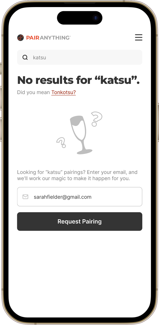
If we don’t have a pairing recommendation for a food or wine, we'll show the closest match, and let users request the pairing via email.